Case Study: Food Tracker
‹ Back to Case Studies
Case Study:
Case Study:
Food Tracker
/01 Context
Food tracking was a core product of SparkPeople, easily one of the most used and complicated features we offered.
Over the years there were many iterations of it, constant upgrades and feature enhancements based on user feedback.
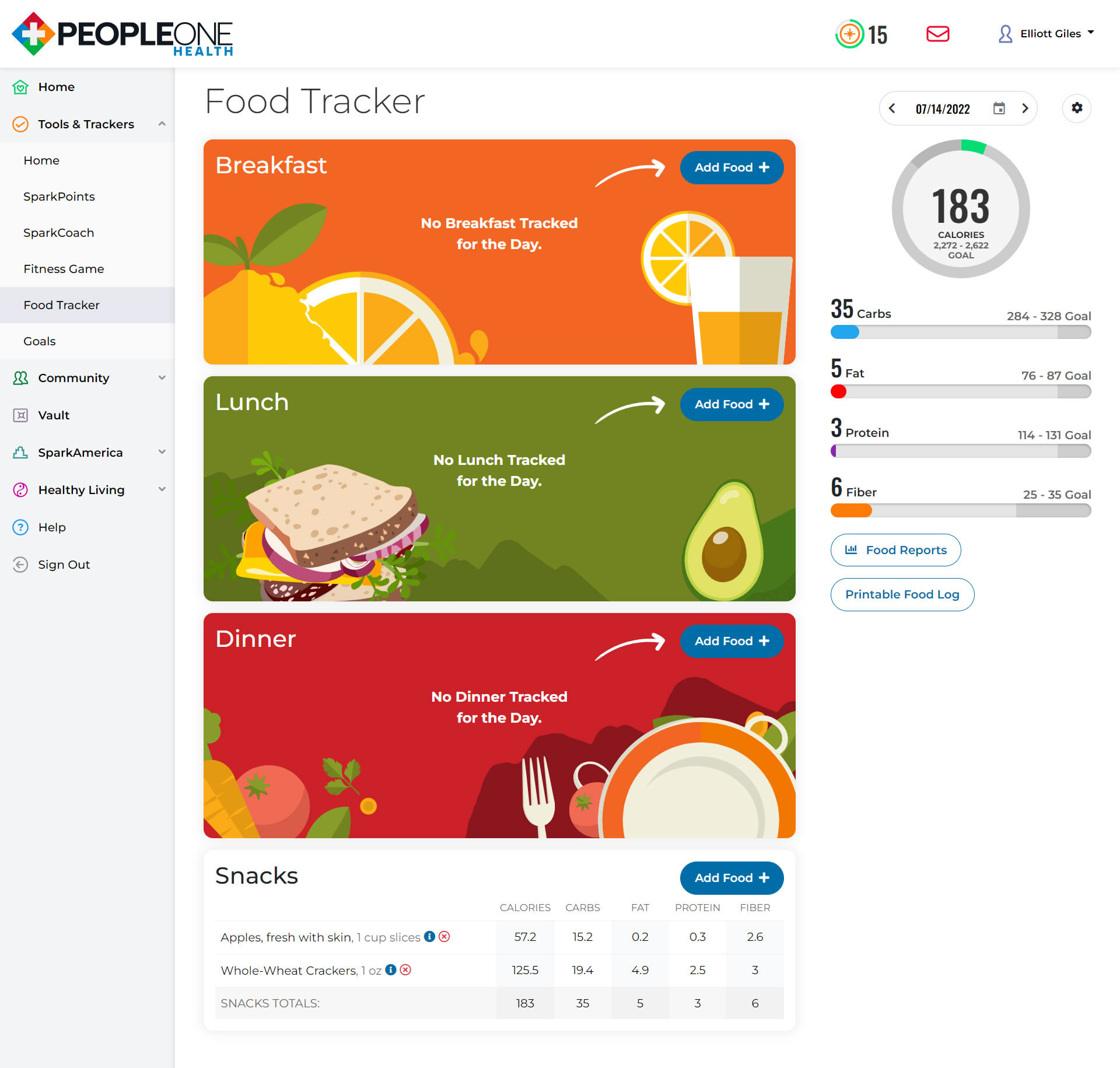
Before the user has tracked food for the day was a great opportunity to liven up the design, adding colorful illustrations to what would otherwise be very plain look. An arrow draws your attention to what you should do first on the page, creating an immediate call to action.
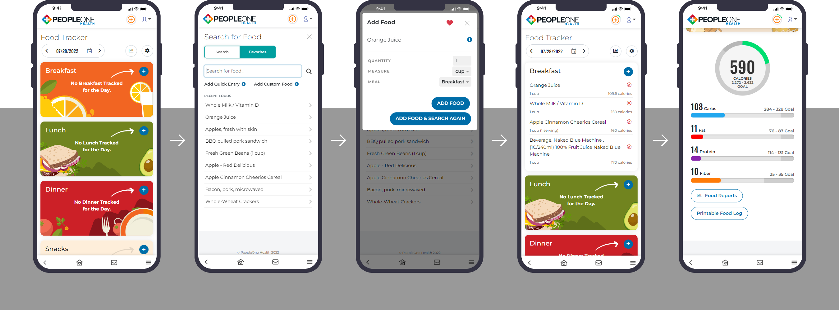
Where to place the graphs and feedback was always a dilemma. I managed to squeeze it in beside the list of foods on desktop and added a button that scrolls you down to the start of the graphs on mobile, letting the user get instant results and feedback on how they are doing for the day without the scrolling.
Over the years there were many iterations of it, constant upgrades and feature enhancements based on user feedback.
Before the user has tracked food for the day was a great opportunity to liven up the design, adding colorful illustrations to what would otherwise be very plain look. An arrow draws your attention to what you should do first on the page, creating an immediate call to action.
Where to place the graphs and feedback was always a dilemma. I managed to squeeze it in beside the list of foods on desktop and added a button that scrolls you down to the start of the graphs on mobile, letting the user get instant results and feedback on how they are doing for the day without the scrolling.
Tools Used:
HTML, SCSS, Jquery, Bootstrap, Visual Studio, ASP.NET MVC, Fireworks, Illustrator, Figma
/02 Roadmap
Where do we need to go?
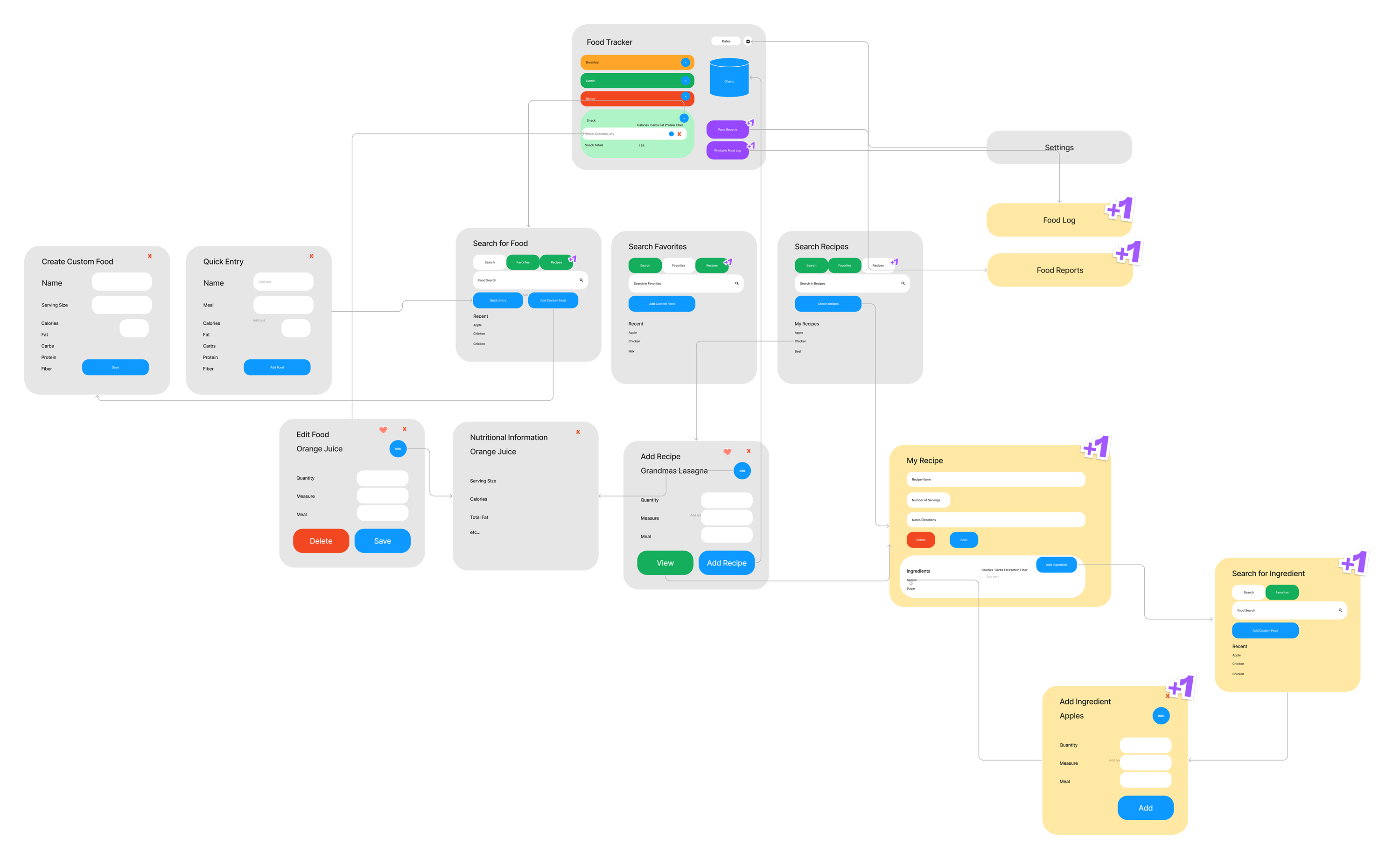
It all starts with a plan. Fortunately we had been there before a few times, with countless features added and revised based on user feedback. Several features we knew we wanted, but might not make it into the first round. Version 2 was displayed in yellow with the +1 stickers in this FigJam sketch.
/03 Execution
Keeping it Responsive.
We needed the design to not only work on desktop but for our mobile apps. Making the features W3C Accessible was also important to ensure that it could be used by anyone and avoiding future redesigns down the road.
/04 Ease of Use
Keeping it simple.
Another question was how much information to display on the main tracking page.
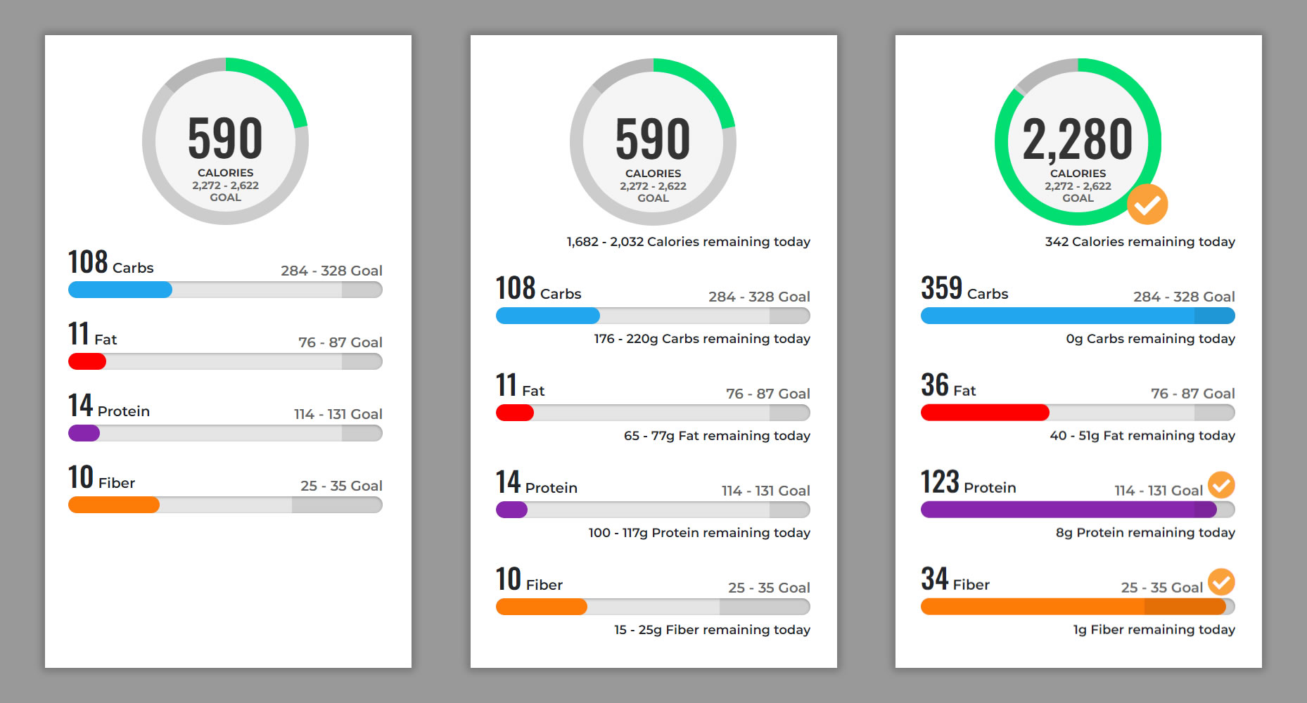
Tapping or hovering your mouse shows the details of nutrients remaining for the day. This made it easily accessible when the user was ready, but kept it clean and simple to start with.
Checkmarks show you have reached your daily goal. Darker ranges on the bars and circle graph easily indicate the daily range the user is shooting for.
/05 What's Next
Designing for the future.
I usually take the coding a bit farther than most designers. This video shows some of the work in action before handing it off to our developers. Most of the Javascript was complete; it was really a matter of plugging in the foods eaten into an object for the developer. The foods appeared in the appropriate sections and it totaled the daily nutrients for the animated charts.
Planning ahead for upcoming features helps keep the design looking good. Recipe functionality and a food barcode scanner for mobile apps slated for the second round are designed in and turned off for easy first round deployment.
Planning ahead for upcoming features helps keep the design looking good. Recipe functionality and a food barcode scanner for mobile apps slated for the second round are designed in and turned off for easy first round deployment.